Sunday, December 16, 2012

Artist 6: Patrick Norguet

Patrick is a French product designer in Paris. Or at least I think he's in Paris. Regardless, I'm not excited by his works. They're all sleek and modern and leaves a dull taste behind. Something about his pieces just doesn't fit right with me. I got these images from http://jump.dexigner.com/directory/21160.

 Republica chair
For example, this chair doesn't look very comfortable. Front, back, side... It all looks uncomfortable. Then again, I AM judging based on looks.

 Mobilier d'extérieur 'Côme' McDonald's
Despite the fact that his works do not interest me, I really like this setup! It impressed me because I have never seen a setup like this. I can only image the time that was put into this environment. Kudos to Patrick for his diligence~!

Coffee cup
The best of Patrick's pieces!!! This simple thing totally has me going for it. I wish I had these cups. I'm just like a kid who is attracted to bright colors. I honestly believe these coffee cups would sell well among the community.

Artist 5: Allan McCollum

Allan's works are way cool! Holy geez. I like big scale stuff, but man, I can just imagine how much time and effort he probably put into his works and it just kills me because it probably took FOREVER! I stumbled upon his name in the list of installation artists that I found and I ended up looking him up on Wikipedia. That's where I got my images and info on Allan.

The guy was born in California. Yay for Californians! I'm one of their breeds. Heheheh. I do realize I undergo tangents here and there, but it is the fine, unnecessary details that usually catch my attention. Californian-born artists will usually get my attention for just that reason.

 Collection of One Hundred Plaster Surrogates

If Love Had Wings: A Perpetual Canon

Monoprints

 I totally dig the Canon and Monoprints works! Details, details, details! That's my interest!

Artist 4: Stan Herd

Omg. This guy is insane! Stan is a Crop Artist who creates Earthworks mainly in Kansas. I didn't even know Earthworks was a type of art until I saw his pieces! The guy's insane!


That's way cool! I just got the images off of Google images, so I'm not sure what his works are called, but who cares when they're that cool? It makes me want to work harder on my comics. Nothing is better than feeling inspired from other people's works.

Artist 3: Mari Richards

The following images were taken from www.coroflot.com/maririchards. Mari is a Product and Identity Designer. After taking a closer look at her Hard Goods design, I was impressed! The pieces are more impressive if you look at the fine details. That's what caught my attention.

I read her bio and she said that she did all sorts of things in the art industry, from instructor to graphic designer to freelancer and etc. I don't know whether to admire that because I do all sorts of things too, and I'm having a hard enough time as is. On the bright side, there's someone that I can relate to in this way.

Hard Goods

Soft Goods
This spider piece is awesome. It makes me chuckle and I can imagine kids playing with it. That's what's best about products: whether they can be used.

Artist 2: Todd Leback

Oh! This guy's works are awesome! I totally dig the furniture pieces. He's from Virginia and he creates pieces that can be easily taken apart. Wicked! The following images were taken from vaneristudio.com.

Longtine Dresser
Storage Unit
 Cantilever
Like...what the heck? He has skill! I really dig his works. Makes me want to buy them so that I can store my stuff. The Floating Top doesn't look that unique, though, so it's my least favorite of his works. It looks bland and standard.

 Floating Top

Artist 1: June Ahrens

June likes to create poetic pieces. I can see that in her works. She's from New York. I specifically like In Depth because of the reflection and composition. It's an amazing piece. The following images were taken from www.sculptorsguild.org/ahrens.html.

In Depth


Our Shrinking World
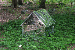
This one is awesome because I get an image of a humongous house/mansion in the middle of a forest.

Still Standing
This one is also amazing because of the shadows that the glass create. Look at them! They look like cheetah spots. I had to look at this photo a couple of times to fully register that there was anything happening at the bottom.

Easily Broken
Of her works, this one is my least favorite. It just looks like a carpet to me.

Saturday, December 15, 2012

Hans Hemmert

Hans Hemmert is a German painter, photographer, and sculptor. Unfortunately, I cannot find any biographical information on him anywhere.

Hemmert's work is very colorful and has an air of childish whimsy. I like how fun and carefree they feel, even though it seems like there is a more serious undertone to them. The large scale makes them seem momentous and important, no matter what he is trying to say with them. They command attention, but I'm not exactly sure if they could keep it for long. They do seem like they would be easy to view and then move on right away because someone might take them at face value as, for example, a tank made of balloons.


German Panther, 2007

(wegkreuz), 2006

Die Haubitze der 52, rue Notre-Dame de Nazareth, 2012

Untitled, 1998
Images from: http://ingesidee.de/page.php?pgid=14&lang=en


Woods Davy

Woods Davy is a sculpture born in Washington D.C. and currently resides in Venice California. He received his M.F.A. from the University Of Illinois in Champaign-Urbana in 1975. Davy is most known for his abstract sculptures made from stacking stones.

His work literally defies gravity. He uses stones to gracefully reach towards the sky in a way that seems almost effortless. I love the natural look of the stone compared with the unnatural and contemporary forms of his pieces.

Cantamar Series, 2012

Granite, 2010

Granite, 2010

Steel and Stone, 1983
Images from: http://www.woodsdavy.com/index.html

Dennis Oppenheim

Dennis Oppenheim received his B.F.A from the School of Arts and Crafts in Oakland California. He then went on to get his M.F.A. from Stanford University in 1966. Oppenheim has been honored with many awards including a Guggenheim Foundation Fellowship.

His sculptures contain an almost sarcastic humor. His saturated colors that he uses on common objects make  his work comical, but still intriguing. He incorporates a lot of architectural ideas in his work'as well. I really enjoy the originality and fearlessness of his work. 


Architectural Cactus, 2005

Brush Building, 2005

Galloping Through Wheat, 1993

Splash Buildings, 2009
Images from: http://www.dennis-oppenheim.com/


Luke Jerram

Luke Jerram is a color blind artist from the UK who is know for his sculptures, installations, and live art projects. He has a team of specialized engineers, craftsmen, and technicians. Some of his most popular artworks are his Glass Microbiology pieces.

I am most interested in his Glass Microbiology work. They have beautifully organic forms and appear to look like they are almost made out of ice. They detail in them makes them look as if they were alive. I love how the light shining through them can change the entire mood of the work.

E. Coli, glass, 2012

Avian Flu, glass, 2012

Swine Flu. glass. 2012
Smallpox, glass, 2012

Images from: http://www.lukejerram.com/glass/

Friday, December 14, 2012

trent's artists

Friday, December 14, 2012

Artist 6

JAMIE SALMON
avatarsculptureworks.com


FRAGMENT #3
THE ELDERLY
THE DIRECTOR
FRAGMENT #4
SUMO
Jamie Salmon is a hyper realistic sculpture. He used to make sculptures for movies. His work is very impressive. The extreme detail he paints onto his sculptures is breathtaking. I can not imagine how much time is put into each one of his pieces. The sculptures are made of silicone, resin, hair, and fabric. These should have more recognition then they do. This is a gift to be this talented at detail.

Artist 5

GEHARD DEMETZ
www.geharddemetz.com


MY SHADOW CAN WALK ON WATER
HOW YOU REACTED WAS RIGHT
LEAVE ME ALONE

EVERYTHING HE LIED WAS TRUE


YOUR FAIRY TALES SCARE


RAGAZZA SINISTRA


Demetz is a wood carver. I wish I was him. Again I love his craftsmanship. I love that everything is so perfect but yet he still has chunks and pieces missing from his sculptures. They are all children but they are all have their own creepy styles to them. I like that his sculptures don't have a classical style. I can't pick what style it is but usually people try to represent some kind of classical style in their work. These are great I don't have any problems with these. The wood ones are very cool. I want to learn how to do this.

Artist 4

JUDSON BEAUMONT
STRAIGHT LINE DESIGNS
BURNT TABLE
CANNED BENCH
TEAR AWAY CRADENZA
CRASH CABINET
BAD TABLE
These furniture designs are very witty. These would be nice to come home to every night. I don't think I would ever get tired of them, and they are unique. The designer is Judson Beaumont. He has his own workshop and his own full time craftspeople. I enjoy the more adult designed furniture. I went through there site and they have a lot of children designs..... Blahhhhh. It got boring from there. But these ideas are genuine and full of excellent design.

Artist 3

DAN WEBB
Runner Left Shoe Detail
RUNNER


Destroyer
DESTROYER


The Putti Trap
THE PUTTI TRAP


Shroud
SHROUD
Sleeper
SLEEPER


Dan Webb's wood work is so extraordinary. If I had the tools and time, this would be the work I would want to do. I love that he takes wood and uses it as an actual piece of material. Usually you would see wood as a furniture element. I love this. The pillow looks soft the shoe looks like I could put my foot in it. There isn't even anything I don't like about this. Super cool.

Artist 2

HERB WILLIAMS
www.herbwilliamsart.com

FIRST NUDE


No Title


jux_crayons5
UNWANTED VISITOR: PORTRAIT OF A WILDFIRE


jux_crayons2


No Title

I enjoy Williams idea of staying with one type of material. I have always wanted to make a project with an already made object. The crayons are genius in my opinion. Not only the crayons but his craft, the way he blends his colors and his craft is perfect. But... I don't think that his work where he copies an exact object works very well. It looks great but his work where he is more expressive like the fire has so much more impact. The blending of colors and use of angles on the fire piece is his best work yet I believe. I chose this artist mainly because of the use of one material. I really enjoy that idea, but maintaining its boundaries is key.

Artist 1

DENNIS SLOOTWEG

photo 1
ROESTKABINET


photo 1
HOGE ROESTKAST-GAAS


photo 1
ROESTDRESSOIR


photo 1
IEPTAFEL


photo 1
TL-KROONLUCHTER


photo 1
GROTE KROONLUCHTER


What I like about Sloonweg's work is that all of it has history to it. He uses all of these old industrial metals that have sat for years, and has now given them a new life as a practical furniture piece. The idea of recycling and practical use makes his furniture rare and almost limited one of a kinds. Everything is rusty and dirty but it all has so much character. His craftsmanship is exactly what meets my standards. I want to have his drive of perfection. What I don't really care for though is the glass he uses for his lights. I don't hate them but I think a smoky or fogged out glass that you would see on old industrial buildings would look better. But that is just me and it doesn't even make a dent on what I think of his work collectively.
No comments: